Create your own headered controls
Since the release of WIndows 8.1 most input controls like the TextBox and ComboBox have two new properties
- Header
- HeaderTemplate
These are really useful properties. They make it much easier to add a label above the input control.
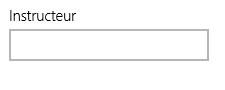
This is how it looks like:
The xaml is really nice, its just this:
<TextBox x:Uid="FlightDetailPageView_Instructor" Header="Instructor" Margin="0, 0,0,10"
Text="{Binding Flight.Instructor, Mode=TwoWay}"/>
Before Windows 8.1 we had to place the label or self with a new TextBlock and had to do the right alignment. Now that is done for us.
When you creating controls yourself its nice to add this feature to your controls aswell. it really speeds up development when using that control later again.
What things you have todo
First create two new dependency properties
public object Header
{
get { return (object)GetValue(HeaderProperty); }
set { SetValue(HeaderProperty, value); }
}
public static readonly DependencyProperty HeaderProperty =
DependencyProperty.Register("Header", typeof(object), typeof(DurationPicker), new PropertyMetadata(null));
public DataTemplate HeaderTemplate
{
get { return (DataTemplate)GetValue(HeaderTemplateProperty); }
set { SetValue(HeaderTemplateProperty, value); }
}
public static readonly DependencyProperty HeaderTemplateProperty =
DependencyProperty.Register("HeaderTemplate", typeof(DataTemplate), typeof(DurationPicker), new PropertyMetadata(null));
After that you need to place the header in your template. This is whre you have to do some styling for the right alignment but mostly this is already enough:
<ControlTemplate TargetType="<nameofyourcontrol>">
<Border x:Name="LayoutRoot" BorderBrush="{TemplateBinding BorderBrush}" BorderThickness="{TemplateBinding BorderThickness}" Background="{TemplateBinding Background}">
<Grid Margin="{TemplateBinding Padding}">
<Grid.RowDefinitions>
<RowDefinition Height="Auto"/>
<RowDefinition Height="Auto"/>
</Grid.RowDefinitions>
<ContentPresenter x:Name="HeaderContentPresenter" ContentTemplate="{TemplateBinding HeaderTemplate}" Content="{TemplateBinding Header}" Foreground="{ThemeResource TimePickerHeaderForegroundThemeBrush}" FontWeight="{ThemeResource TimePickerHeaderThemeFontWeight}" FlowDirection="{TemplateBinding FlowDirection}" Margin="{ThemeResource TimePickerHeaderThemeMargin}"/>
<!-- place ytour control in the second row -->
</Grid>
</Border>
</ControlTemplate>
As you can see the control exist of a grid which have two rows. The first row is used for the Header and the second row you can use for your control.